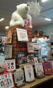
 L is for Love: A Heartfelt Alphabet is one of those odd little gems that looks like it is from 1950 but is very 2018. The illustrations show you the alphabet of love and friendship. The illustrations are casually modern. Nothing is forced, and things flow with the diversity of people (bi-racial copy, people of color). In fact, the P is for Poetry shows the girl reciting “How do I love thee?” (Or I assume she is…. She is kneeling, with paper in hand, boy in front of her. However, Greg Paprocki you goofed by having the soda pop/straw near the young man’s lips….)
The only real issues I have is family/relationships are nuclear and there is a lot of gender-traditional clothing (while females wear pants, there are a lot of cute dresses, but that does seem to fit the theme of the image, such as dressed up for the party). But to be “all out politically correct” is not the point of the story. The story is about Love. The story is about Friendship. The story is about the Alphabet. This is not the place to make an “in your face” political statement. And therefore, the subtleness of it, makes it a real treat for me.
Now to the artwork. Are there a lot of pinks, red, and “lovey-dovey” colors? Yes, but after all, why not? It is a love book/Valentines’ book. Is there a lot of detail? Oh boy, yes! The pages are just crammed with goodies. You can almost have yourself a “Hide-and-Seek” party looking for everything on the page.
This is a board book for the modern child. It is a book for the person who collects alphabet books. Paprocki has several alphabet books done in this classic-modern format. Multiple subjects and holidays are covered.